
KFC Mobile App
UX | UI | UX Research
Overview
KFC is starting to shift their focus to an online presence with an ordering/delivery web app. However, in a market that has a vast selection of food ordering services on the go, KFC's users were skewed towards a desktop experience. It was time for KFC to shift behaviour from desktop cases towards frequent mobile brand experiences. Note: This is a POC project and not client work.

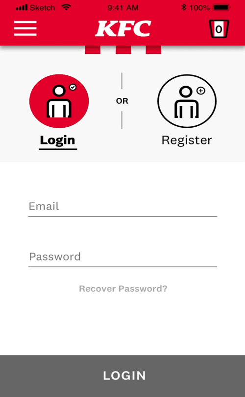
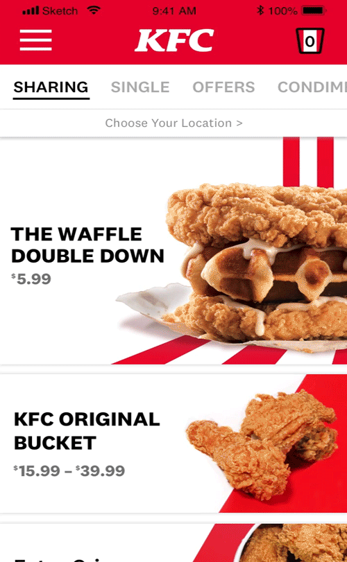
Existing KFC desktop and mobile web app.
The Approach
I started exploring the order.kfcdelivery.ca web app as a starting point and performed an analysis to see what was working, what could be improved and any new features that could be added. A 10 question survey was conducted to gain insights on users behaviours for the ordering process. Following the survey insights, A user testing scenario was created with 6 volunteers to validate our initial thoughts.
20 Survey Respondents

6 Users Tested the Existing Web App
Some of the sample questions are as follows:
-
What method do you use to order food (pickup, calling, website, app)? Briefly explain why you would use this ordering choice?
-
When ordering online through an app or website do you check out as a guest or have an account?
The task was for the user to create an account, and order a meal for themselves and one other. They could pickup or get delivery depending on their preference. The scenario was completed at my condo while watching football with friends to create a natural atmosphere.
Understanding Our Users
After collecting the data from the surveys, testing and analysis; I began to evaluate the insights and group patterns through an affinity map. This led to developing an empathy map to outline current pain points users have with the product. From there a persona was created empathize with our users goals and needs.


Opportunities
We started by examining three key-findings in which we could further explore solutions for.

01.
The experience felt disconnected from the Colonel and KFC brand voice. Is there a way to incorporate a personal brand activation that's more engaging?

02.
KFC needed a better way to reward its users. The current solution Colonels Club requires users to download another app and show the coupon at Point of purchase.

03.
It takes a long time to place an order. If we want a user to frequently engage with the app we will need to simplify the process.
So What's The Competition Doing?
We looked at several products that users referred to from the insights to see how their experiences differ from KFC.

01.
McDonald's integrates brand personality in the app making it a more memorable experience through a number of pleasurable visual cues.

02.
PC Optimum rewards program is catered towards each user as they make purchases. Personal offers become available as they engage more with the app and purchases.

03.
Skip the dishes allows the user to effectively compare from multiple restaurants for pickup or delivery allowing for an ease of use process.
Optimizing The Flow
By identifying the cognitive friction points through our research, we were able to revise an optimized flow allowing for a more efficient process.

01.
Integrating more visuals, products and branded content will allow for the brand personality to be prominent creating an ownable product.
02.
The Rewards/Offers content directly lives in the global navigation to create a unified experience whether you're ordering online or picking up in-store.
03.
The pickup/delivery form has been optimized with an auto fill form for your location and preferences in four less entries.

Explorations
Taking our initial research and updated user flow, we began sketching possible ideas.
Iterations
We began taking it to the drawing boards... or screens and iterating on each approach to create possible solutions for our key-findings.

A bottom nav allows the user switch between pages in one click, but left a lot of sub navigation on each page.

The hamburger menu uses a sequential hierarchy to organize the content, but the menu page resulted in one long scroll.

Adding a Category carousel to navigate the menu allows for efficient scanning and a hero image to help create an emphasis on the brand.


Design kit
While designing wireframes and high-fidelity screens we were able to identify components, and start to explore various spacing, colour and typography styles.
What We Delivered
Finally we had arrived at our solutions to the three pain points identified with the current web application.
01.
The Current app had little to no brand presence integrated. We've implemented a branded voice and visual language that is reflective of the Colonel's personality. Through original content writing and an own-able illustration style the KFC brand is present throughout the entire experience.

02.
The Colonel's Bucket is our new rewards platform integrated in the app allowing users to earn points for every purchase. As purchases are made customized rewards will be tailored to a users preferences.

03.
The new flow allows the user to easily choose their preferences through fewer taps so they can order more efficiently. You can also enable your location to find your preferences and closest store, saving time from manually filling in the form.
Looking back...What Would We Do Differently?
Looking back, I feel there is room for improvement on the UI architecture particularly the global navigation. There were a couple different patterns explored, but the hamburger icon is where we ended up since there were six page categories. Going forward it would be great to simplify the global and local navigation and incorporate it into the footer for better usability.